Going against the flow with brand and visual identity for new water utility company
Bright thinking underpins naming and marketing communications in deregulated utilities market
The challenge
The deregulation of the water utility market in Scotland opened the taps for new, agile entrants into what was previously a monopoly situation. Glidden were tasked to develop naming, brand and visual identity for a new business aiming to take a slice of the lucrative market.
Our approach
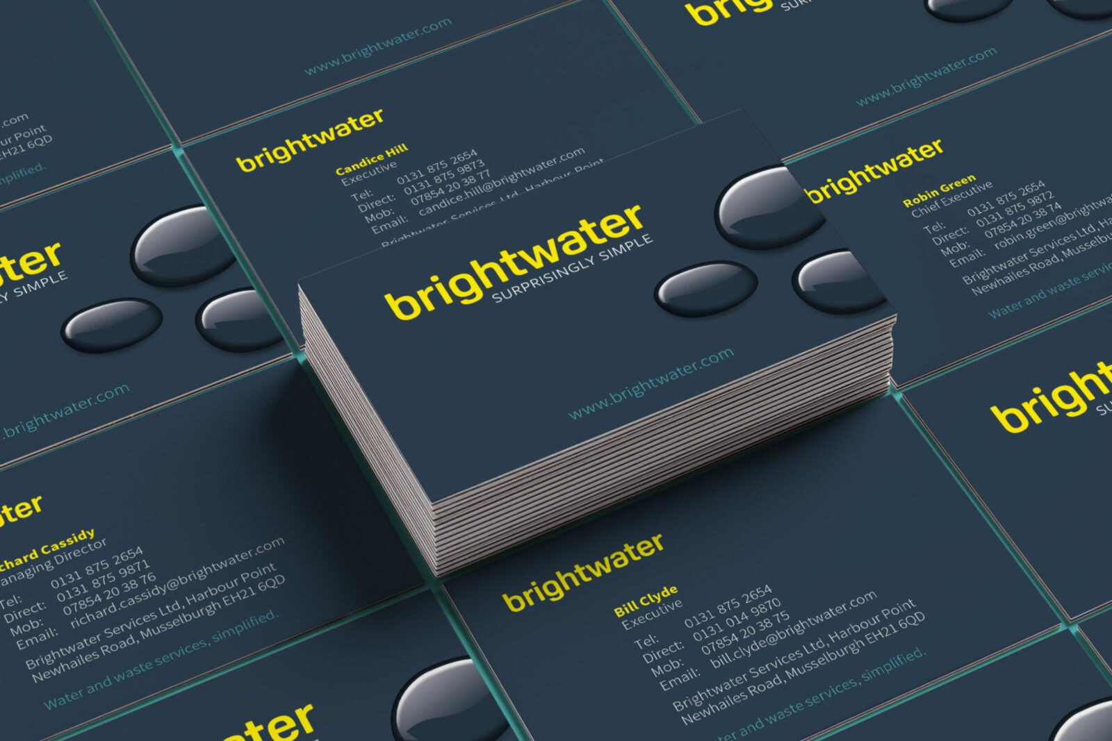
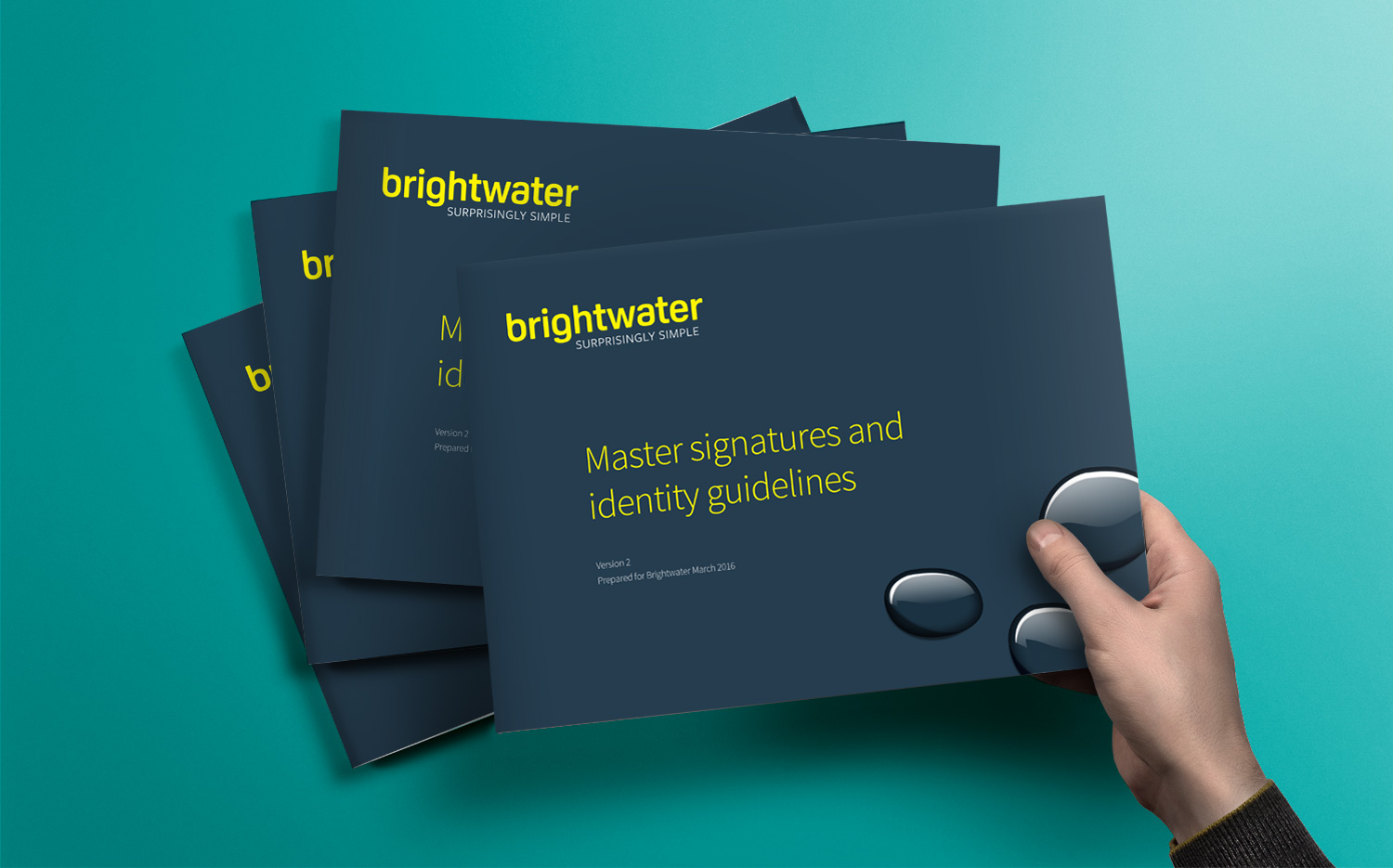
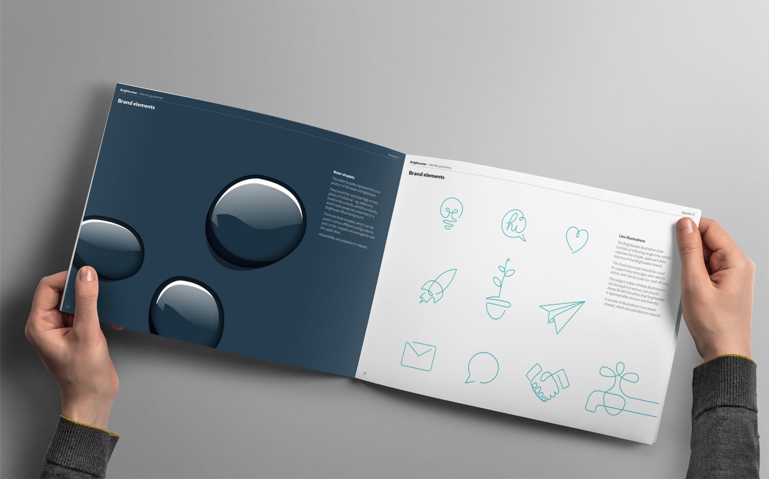
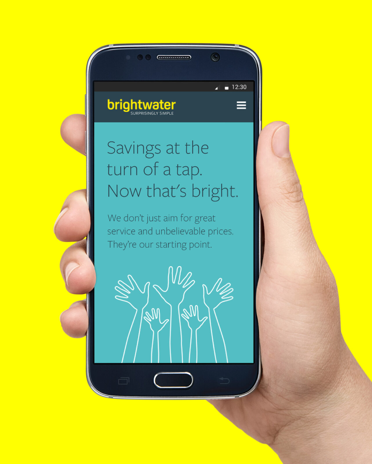
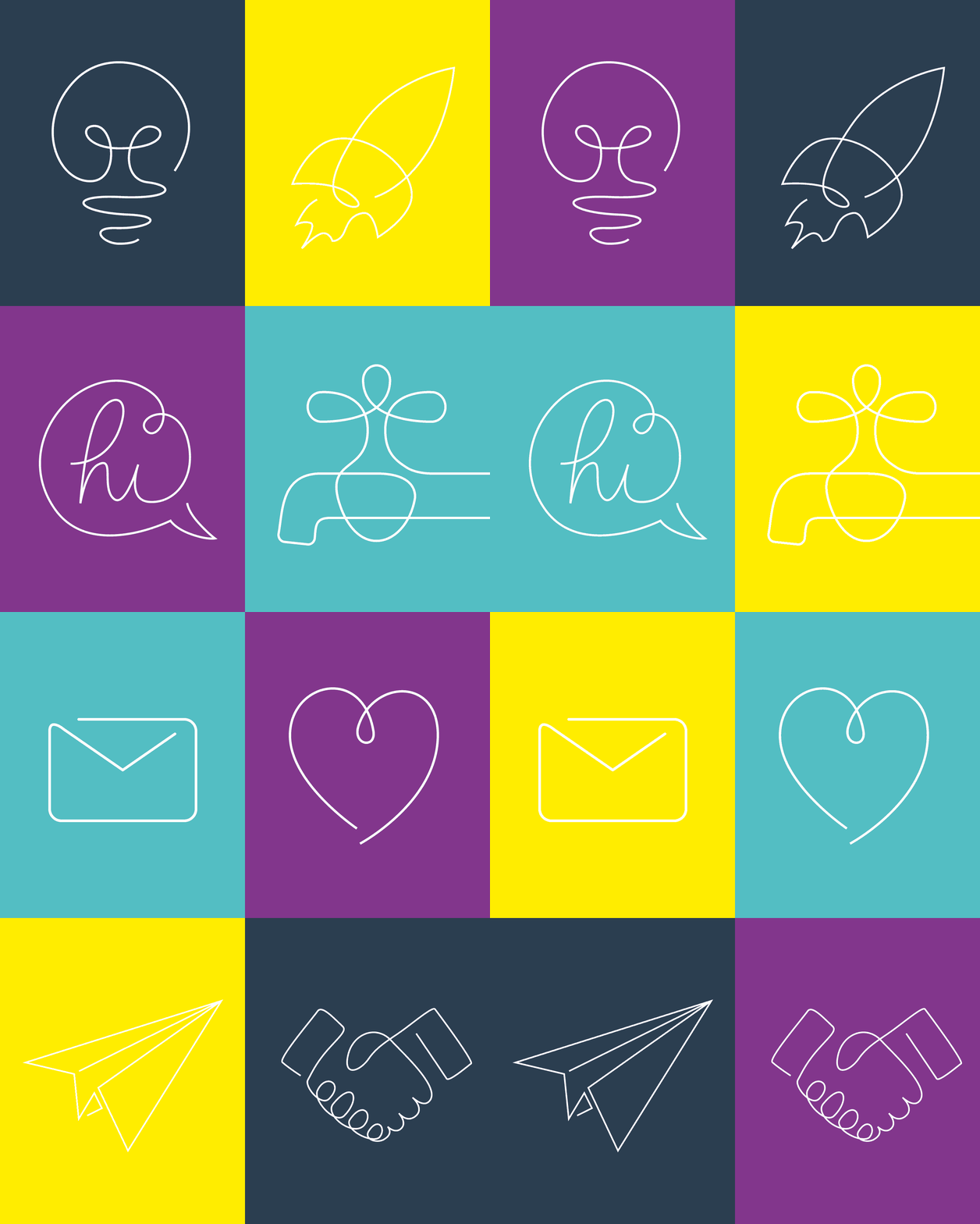
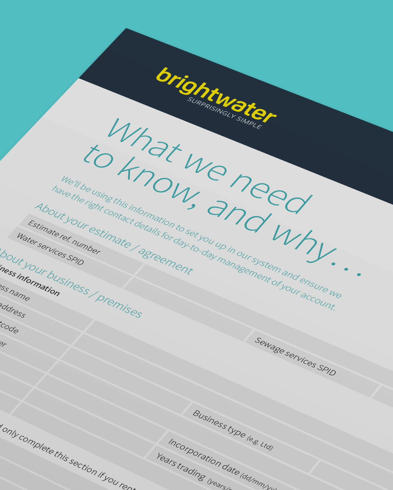
To create the feeling assurance whilst also being a disrupter. We developed the name ‘Brightwater’ to convey a sense of being the ‘intelligent’ or ‘smart’ choice. Avoiding the cliched images of reservoirs and blue identities featuring water droplet symbols, we instead developed a type-only brand identity in bold zesty yellow, the all-lowercase typography conveying friendliness whilst the navy blue & white staging colours communicate professionalism. The introduction of quirky line illustrations give a sense of charm and provide a bold, flexible character for ongoing communications.
Project scope
Naming
Brand identity
Graphic design
Marketing communications
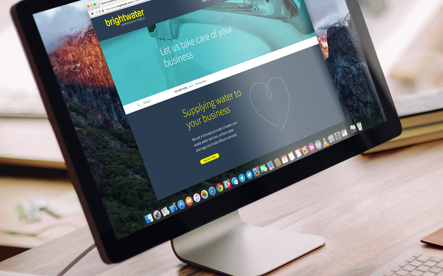
Website design
Digital marketing
Illustration
Interior, exhibition & display
